ShopDreamUp AI ArtDreamUp

Deviation Actions


Suggested Deviants


Suggested Collections


You Might Like…


Description
" EDIT " added more details.
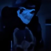
Ok this my first time to try and make a clan layout .
.
Client: The Central Guard
Tools: Photoshop CS4 ext
logo provided by client. ( modified by me ... )

(copyright overlay to help protect client )
Ok this my first time to try and make a clan layout
Client: The Central Guard
Tools: Photoshop CS4 ext
logo provided by client. ( modified by me ... )
(copyright overlay to help protect client )
Image size
1200x1400px 380.1 KB
© 2009 - 2024 EnzuDes1gn
Comments107
Join the community to add your comment. Already a deviant? Log In
The only downside I can see, like most others have mentioned is that it is cluttered. You can get rid of this by reducing the width of the two side panels and englarge the center panel, but functionality would then be compromised. If it was me i'd make the right panel smaller or move it to the bottom of the page in a smaller horizontal panel. You really want advertise your clan more than your sponsers and friends and unfortunately the reverse is happening in this design (great for your sponcers but not for you). I can see where your goin and what your aiming at and the more I think about it the more I think moving and seriously reducing the size of your adverts to the bottom would also remove the "cluttered" feeling we all seem to get from it. <img src="e.deviantart.net/emoticons/b/b…" width="15" height="15" alt="